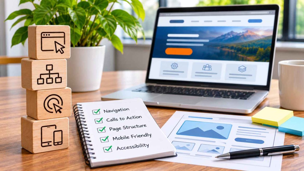
A business website can have professional branding, detailed service descriptions, and a steady flow of traffic while still making everyday tasks unnecessarily difficult. Visitors may struggle to locate pricing information, find a contact button, or understand which service meets their needs.
These problems do not always justify a complete website redesign. In many cases, smaller improvements to navigation, content organization, and interactive elements can address specific usability issues without rebuilding the entire site.
For business owners, the most productive approach is to examine how visitors actually use their website, identify obstacles, and prioritize changes that support meaningful interactions.
Start With the Needs of Website Visitors
Before changing colours, layouts, or software, consider what people are trying to accomplish when they visit the website. Their objectives may differ depending on their familiarity with the business and the page through which they arrive.
For example, a commercial cleaning company’s website might serve property managers comparing maintenance packages, business owners requesting one-time cleaning services, and existing customers looking for support.
Each group needs access to different information. A website that directs everyone towards the same contact form without first explaining its services may create unnecessary confusion.
Business owners can identify common visitor needs by reviewing customer questions, speaking with sales and support teams, and observing how unfamiliar users navigate important pages.
Identify Common Problems With Website Navigation
Navigation problems often develop gradually as businesses add services, publish articles, and introduce new website features. Over time, a previously straightforward menu may become crowded or inconsistent.
Review Menu Labels and Page Organization
Menu labels should describe the information visitors will find. A title such as “Services” is generally easier to interpret than an abstract phrase that requires familiarity with the company’s branding.
Related services should be grouped logically. Visitors should also be able to reach important pages without moving through multiple unnecessary menu levels.
Check for Missing Connections Between Pages
A visitor reading an article about commercial roof maintenance may want to explore the company’s inspection services. If the article provides no relevant onward link, the visitor must search elsewhere on the website.
Adding useful internal links between related resources, service descriptions, and contact pages can make navigation more consistent without expanding the main menu.
Make Calls to Action Clearer and Easier to Locate
A call to action (CTA) gives visitors an opportunity to complete a task, such as requesting a quotation, downloading a guide, or scheduling a meeting.
Unclear buttons can introduce uncertainty. For instance, a button labelled “Get Started” might lead to an account registration page when visitors expect to see pricing information.
Descriptive wording such as “View Service Plans” or “Request an Estimate” helps communicate the destination before someone clicks.
WordPress tools such as WP CTA Pro are among the options businesses can evaluate when looking for ways to manage website actions. However, the purpose and wording of each CTA should be established before selecting any additional functionality.
Improve Access to Important Actions on Longer Pages
Detailed service pages and advertising landing pages often contain photographs, comparisons, testimonials, and frequently asked questions. These sections can be valuable, but they may also place considerable distance between a visitor and the main contact button.
Businesses exploring Sticky CTA WordPress functionality can consider persistent buttons or bars that remain accessible during scrolling. This approach gives visitors another route to an important action without requiring them to return to the top of a page.
For instance, a landscaping company might display a compact estimate request button while homeowners browse its project gallery and service descriptions.
A persistent element should complement existing navigation. On short pages where the primary button is already easy to locate, it may add little value.
Maintain a Clear Visual Hierarchy
Visual hierarchy helps visitors distinguish primary information and actions from secondary elements. When every button uses the same prominent styling, people may struggle to understand which option is most relevant.
A professional training provider could emphasize its course registration button while presenting curriculum downloads and general inquiries as secondary links.
This does not mean secondary actions are unimportant. Their appearance should simply reflect their role within the current page.
Consistent colours, descriptive headings, readable spacing, and a limited number of competing messages can help visitors interpret the layout.
Consider Mobile Usability and Accessibility
Website improvements should work across different devices and accommodate different interaction needs. A floating contact bar that occupies little space on a desktop monitor may cover essential information on a smartphone.
When evaluating a sticky CTA solution for WordPress websites, administrators should check how it interacts with mobile menus, cookie notices, existing chat widgets, and contact forms.
Buttons should have comfortable touch targets, sufficient colour contrast, descriptive labels, and visible keyboard focus. Test whether focused controls remain visible and whether visitors can reach the bottom of the page without content being obscured.
These checks should include actual mobile devices, particularly when forms trigger the on-screen keyboard.
Prioritize Website Improvements by Their Practical Impact
Not every usability problem deserves immediate attention. A slightly inconsistent heading style is generally less urgent than a broken checkout button or a contact form that fails to submit.
Businesses can organize improvements according to three considerations:
- Severity: Does the issue prevent visitors from completing an important task?
- Frequency: How often are visitors likely to encounter the problem?
- Implementation effort: Can the issue be resolved through a small adjustment, or does it require substantial development?
Address critical functional problems first. Then prioritize improvements that remove repeated obstacles from common visitor journeys. Cosmetic refinements can follow once essential interactions are reliable.
Establish a Repeatable Website Improvement Process
Website usability should be reviewed regularly rather than treated as a one-time project. A practical improvement cycle begins by selecting an important task, such as requesting a consultation, and testing the entire process from the visitor’s perspective.
Document where difficulties occur, choose a targeted improvement, and test changes in a staging environment where possible. Once the update is live, verify that the original problem has been resolved without introducing new issues.
Businesses can monitor completed inquiries, form errors, booking confirmations, and CTA interactions to understand how changes relate to their objectives. Avoid interpreting additional clicks as success if visitors still struggle to complete the underlying task.
Comparisons should account for other changes in traffic, offers, and website conditions.
Conclusion
Improving a business website does not always require major investment or a complete redesign. Clearer navigation, better content connections, descriptive calls to action, and accessible persistent elements can address specific problems within the existing layout.
The most useful improvements begin with understanding visitor needs and identifying where the website makes those needs harder to satisfy. By prioritizing functional issues, testing changes carefully, and reviewing meaningful outcomes, businesses can develop a more consistent online experience over time.
Good website design makes everyday tasks feel straightforward, giving visitors a clear path to information and the freedom to act when they are ready.


